The Revamp.
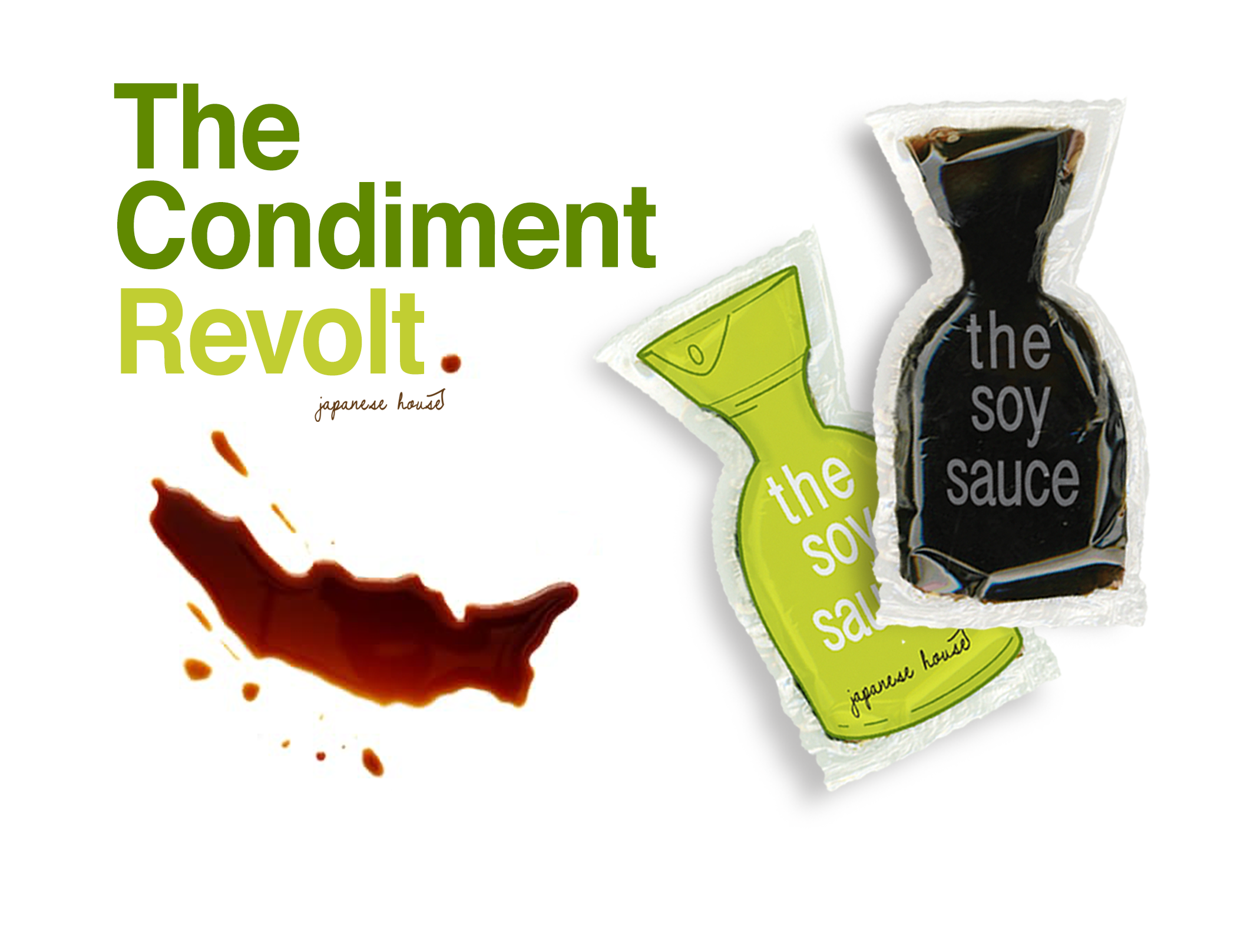
Sometimes you can take a traditional idea and strip down to its bare essentials. Japanese House transitions an average restaurant to a modern and culturally booming hot-spot. The logo is informal, not needing capitalization, and compliments the simplicity of the packaging that follows.
The innovative soy sauce packet is shaped and designed to replicate the classic soya sauce bottle but in condiment size and material. Though all packages are simply stated and concise, the fascination is that there is more to be said when there is less on the box.


